Stop the silo madness! Effective site architecture for SEO and findability
Content silos negatively affect both the browsing and searching experience which often results in lost sales.
However, to professionals in different industries the word “sitemap” (one word) and phrase “site map” (two words) have the same meaning: a wayfinder site map.
Sometimes the single word “sitemap” is interpreted as an XML sitemap. And the phrase “site map” is interpreted as wayfinder site map.
Sometimes, I observe an XML sitemap on a website being used as a wayfinder site map. The whole SEO jargon thing can become a usability and user experience (UX) nightmare.
Another confusing word in SEO jargon is the word “silo.” Contrary to popular opinion in the web marketing industries, content silos do not make website content easy to find. In reality, content silos make website content more difficult to locate and discover. They often result in lost sales.
Let me explain….
Information architecture pattern – hierarchical structure
According to the Usability.gov:
Information architecture (IA) focuses on organizing, structuring and labeling content in an effective and sustainable way. The goal [of IA] is to help users find information and complete tasks.
If users have a difficult time completing their desired tasks, businesses can lose sales, leads and brand credibility.
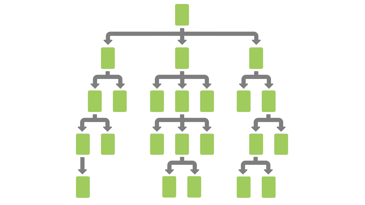
One common IA pattern is a hierarchical structure. A foundation of many effective information architectures is a well-planned hierarchy.
Below is an diagram of a straightforward hierarchical structure.
 A hierarchical structure is a common type of taxonomy. To view four common types of taxonomy, read Website Taxonomy Guidelines And Tips: How Best To Organize Your Site.
Most site visitors expect a website to be categorized. Categorization itself does not make content more difficult to find. Problems arise when categories are:
- Not organized in ways that match user expectations
- Not labeled to match user/searcher mental models
- Formatted to limit accessibility to desired content
One way to limit content accessibility is a process called siloing.
A silo is not a category
Contrary to what you might read in other articles about site architecture, the word “silo” and the word “category” are not synonyms. In the IA and information science industries, they have different meanings.
According to Merriam-Webster Dictionary, a category is a division within a classification system. Items within a category should have particular shared characteristics that are familiar to your target audience.
On the other hand, on a website, a silo is a repository of content that is only accessible under one specific category. The siloed content is isolated, or mostly isolated, from other content within a website. Another way of stating this is “content is boxed instead of being integrated with other components.”
A real-world analogy are kernels of corn located in a farm silo. The corn is isolated from outside elements and from other siloed items. Maybe one farm silo contains corn. Maybe another farm silo contains wheat. And another farm silo contains oats. The grains are not accessible within the same silo.
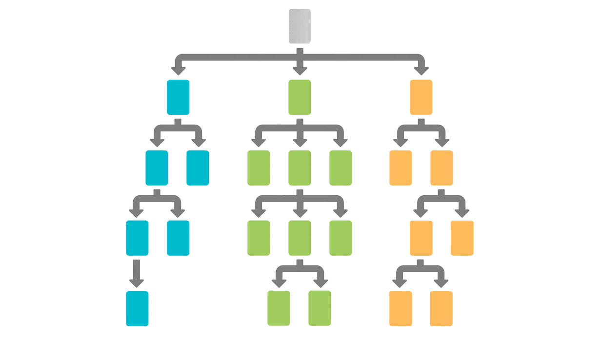
Website categories can become siloed, as shown in the diagram below:
 In this hierarchical website structure, content silos are created in three categories. Users cannot get to their desired content without navigating within a specific top-level category.
In other words, a category is NOT a silo. However, content within a category can BECOME siloed.
Silos make content more difficult to find
Contrary to popular opinion in the SEO industry, content silos do NOT make website content easy to find. The opposite is true. Content silos make content more difficult (or impossible) to locate and to discover within websites and intranets.
In the article The Top Enduring Intranet-Design Mistakes: 7 Deadly Sins, Kara Pernice, senior vice president at Nielsen Norman Group wrote:
Content in a silo (or walled-off content) is content that’s difficult to discover and find. The content may be walled off in multiple ways:
– not accessible via the search function
– absent from the global navigation and subnavigation
– hidden based on user’s role, due to personalization
– protected by a login wall
Silos are a waste of users’ time.
On most websites, users typically engage in two types of behaviors: browsing and searching. With browsing, users who are interested in a product or service are forced to navigate to multiple sections of the site. They typically must drill down to desired content each time they navigate the site. Without clear and consistent information scent, users are unlikely to complete their desired tasks (Add to Cart, Sign Up, Download, Try for Free, etc.)
What about searching? What about SEO?
First, please realize that web search engines are not perfect. They might deliver you to the right place within a site, and they might not. Once users/searchers arrive at your site, they will normally navigate to desired content…following an information scent. When the words of the link match what people are looking for, the more likely it is that they will click on the link.
Users/searchers do not navigate websites via web search engines:
- Do a Google search.
- View search results.
- Click on a link.
- Go to a website.
- Not the right content? Click or tap the Back button.
- Lather, rinse, and repeat.
If a site’s navigation system doesn’t work well for users, they often revert to using a site search engine.
An effective IA and corresponding navigation system actually make web search results and site search results more accurate. I have been teaching this at Search Marketing Expo‘s Boot Camp and other search conferences for over 20 years. Year after year, client data and academic research supports this conclusion.
Other industry experts independently arrive at the same conclusion. Customer experience specialist and author Gerry McGovern wrote in his article, Navigation and Search are Twins:
The quality of search results is highly dependent on the quality of the content being searched. If it has been written and organized in a proper way, then search is going to work much better.
When you search with Google, the first, second and third results don’t get there by accident. Whoever owns these pages has worked really hard to organize them in a way that maximizes their findability.
Usability guru Jakob Nielsen wrote in Top 10 Information Architecture (IA) Mistakes:
Sadly, search and navigation fail to support each other on many sites. This problem is exacerbated by another common mistake: navigation designs that don’t indicate the user’s current location. That is, after users click a search result, they can’t determine where they are in the site — as when you’re searching for pants and click on a pair, but then have no way to see more pants.
Therefore, content silos negatively affect BOTH browsing and searching experience.
So if you want content in your site to have better search engine visibility, minimize or eliminate silos.
Siloed content can negatively affect sales
Whenever I encounter content silos, I look for ways to improve both accessibility and context.
Two ways to minimize the silo effect is to include a wayfinder site map or a site index in global navigation. Make sure that one or both of these items contains links to important content.
However, seasoned SEO pros know that wayfinder pages are not “magic bullets” to solving a websites poor information architecture. An XML sitemap is also not a “magic bullet.” They all can support an information architecture, but they are not substitutes for a poor information architecture.
 John Mueller, webmaster trends analyst at Google, stated on Twitter that [XML] sitemaps do not replace internal linking.
The key to fixing silos within a site architecture is to have a good IA in the first place. However, if your content management system (CMS) does not support the most desirable, effective IA? Contextual navigation is critical.
As James Kalbach wrote in his outstanding book, Designing Web Navigation: Optimizing the User Experience:
As the name implies, contextual navigation can vary. It’s situational. Though links may transition to similar pages at the same level within the site, they quite frequently lead to new content areas, different page types, or even a new site.
Generally, contextual navigation is placed close to the content of a page. This creates a strong connection between the meaning of a text and the linked related pages.
On an e-commerce site, for example, some effective contextual links might be a set of “Complete this Outfit” or “Frequently Bought Together” upsell links, as shown on the Nordstrom site below:
 Upsell links are one way to eliminate siloing on product pages in an e-commerce site.
On a different type of e-commerce site, not showing related accessories can be a direct cause of lost sales. Baymard Institute’s study (available at PDP UX: Provide an ‘Included Accessories’ Image and Clarify That Optional Accessories Are Extra), the researchers concluded:
During testing, when there was no image in the main image gallery that showed a product alongside its included accessories, many users concluded that it meant that the product then didn’t come with any accessories.
This will directly impact sales, since users comparing two different products — one where they can see it comes with accessories, and one where they can’t see if it comes with accessories (because there’s no “Included Accessories” image provided) — will wrongly attribute lower value to the latter product, simply because the accessories aren’t depicted.
(PDP = product details page; UX = user experience).
In conclusion, silos:
- Impede location and discovery
- Can result in lost sales and leads
- Are a waste of users’ time, and, therefore, do not support usability and UX
- Make both websites and intranets seem less trustworthy
I support silos in the farming industry. However, I do not support silos in the information architecture, usability, UX and SEO industries. Maybe you should, too.
